

Becoming Headway London marks an important moment for our organisation – not just a change of name, but a reflection of how our work has grown across the city.
As we announce our plan for the next five years, and our reach expands from 13 to 17 boroughs, we wanted our visual identity to grow with us. This is the story of how we got there.
Starting with our members
From the beginning, it was important our new logo wasn’t something done to our community, but created with it.
Development began with a simple question: what should Headway London feel like? To answer it, we invited members – supported by our amazing volunteers and staff – to share their ideas through an accessible, open‑ended questionnaire.
There were no right or wrong answers. Everyone was encouraged to take part – by writing, drawing, or talking through their thoughts with staff support. What came back was rich, thoughtful, and full of personality.
Members spoke about togetherness, growth, and a sense of all of London. They described people, family, conversation and connection – alongside a clear steer on what the logo shouldn’t feel like: not dull, not overly medical, and not rooted in stereotypes about brain injury. Playful. Bright. Human. Cheeky, even.
These responses set the tone for everything that followed.
![]()
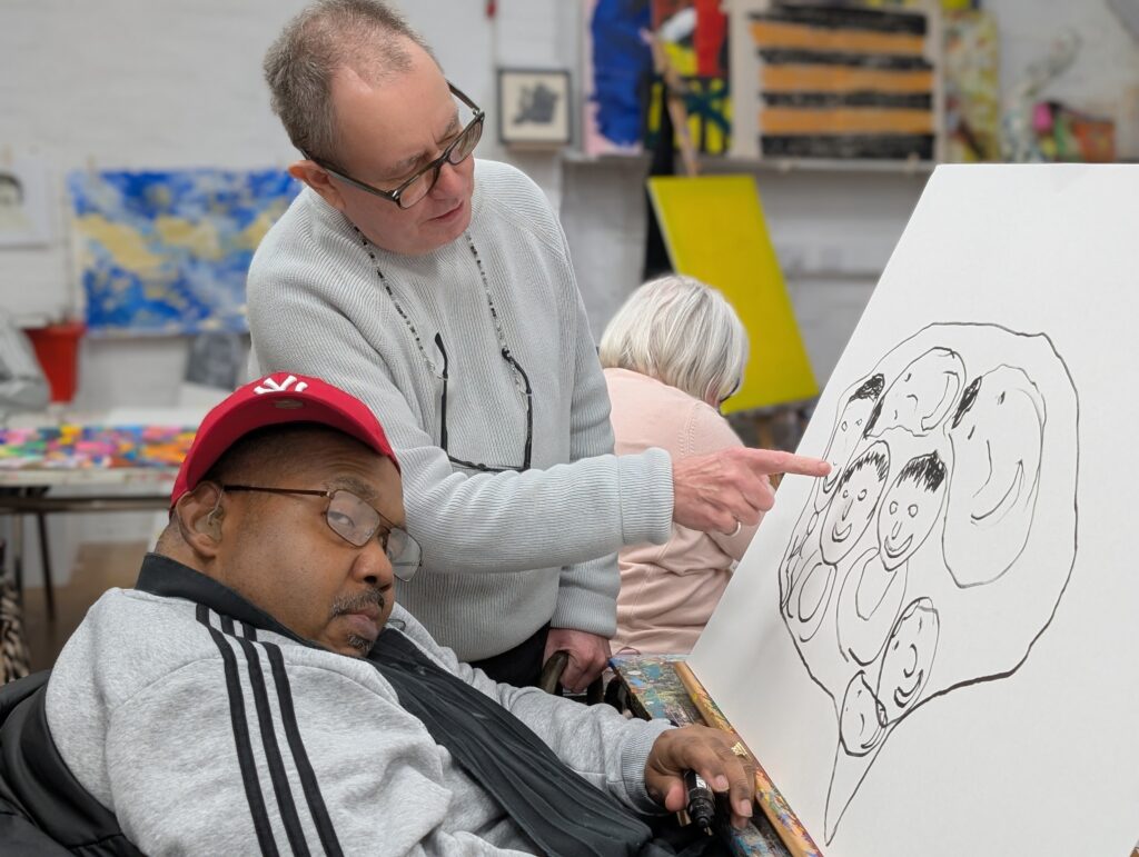
Workshops, artwork, and exploration
We recruited two experts to lead us, running workshops with members, staff and volunteers over a number of weeks.
Long-time member and artist Billy Mann stepped in. Joining him was former-staff-member-turned-independent-artist Emily De Kersaint Giraudeau, who took time out from her hand-painted enamelware business to return to the Studio.
Together, they looked closely at existing member artwork and experimented with different visuals.
Early on, the brain emerged as a recurring image, sitting at the heart of everything we represent and do, but members had very different interpretations of what that brain might look like: London landmarks emerging from folds and synapses, words and emotions filling empty space, cartwheel rainbows, soft gooey strokes, abstract shapes in bold primary colours.
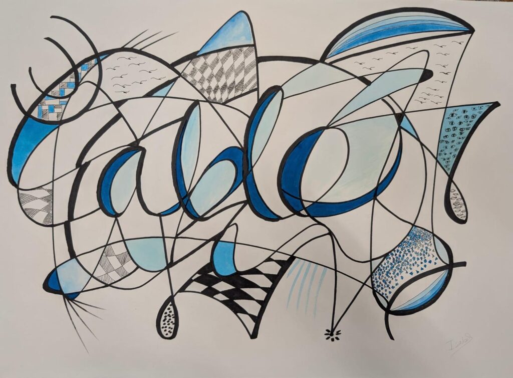
One seemingly unrelated piece of artwork by member Isabel also stood out. Could the word “Able”, formed through loops and lines, echoed the pathways of a brain, or perhaps even a map winding its way across London?! With Isabel’s permission, her artwork became something to respond to and build on.
Developing the design together
Using further ideas gathered from the questionnaires and workshops, Billy and Emily began developing the logo concept, experimenting with symmetry and reflection, movement and shape. Handwritten lettering – inspired directly by members’ handwriting – was explored alongside more traditional fonts.
Colour palettes were tested, drawing on suggestions around brightness, warmth and energy. At one point, the logo was even created as a lino print, intentionally keeping a handmade, imperfect quality before being carefully refined. This helped ensure the final design didn’t lose the warmth, character and personality members had asked for.

Beyond the logo
Alongside the logo, we also commissioned Emily to create a set of new illustrations and icons. Developed using the same collaborative approach, these icons represent what already happens within our existing walls – creativity, care, conversation and humour – as well as what might come next as we grow into new spaces and communities across London.
Together, they give us a flexible visual language we can use across our communications, helping us tell our story in ways that feel accessible, playful and rooted in lived experience.
The personal became universal. One member’s iconic acrylic nail shape was added to our hand icon. The exact mug members sip tea from formed a personalised cup emoji. We drew up the bottle of hot sauce many members keep in the cupboard to spice up their daily meals in the centre, and copied the exact shape of our beloved kitchen spoon in print.
These items tell the story of who we are, and who we might become as we develop new services across the city.
![]()
The result!
The final logo is the result of many small decisions, conversations and collaborations, shaped by many hands.
Most importantly, it reflects how we work as an organisation: co‑produced, thoughtful, and grounded in relationships. Speaking about the process, Billy said:
“It is always important to me that at Headway we all do things together. Deliberately inviting members, staff and volunteers to be part of a creative process such as this is a good way to remind ourselves of the power of working collectively.
I like that the logo acts as a kind of 3-piece puzzle (brain, river, connectivity). I hope they like the look of it enough to work out how the 3 pieces of the puzzle fit together.”
As we step forward as Headway London, this logo reminds us that growth doesn’t have to mean losing who you are – it can mean carrying that identity with care, into new spaces and places, and seeing what emerges next.
We can’t wait to take you on this journey with us.